In brick-and-mortar retail, space is the ultimate currency. When layout strategy is flawed, store owners often default to the wrong solution: blindly cramming more inventory onto the floor. However, high-density merchandising without a logical traffic flow backfires. It restricts sightlines, triggers claustrophobia, and drives customers to a hasty exit.
True space optimization is a balancing act between merchandise density, seamless traffic flow, and visual exposure. In an era of tightening supply chains and soaring operational overhead, optimizing your sales floor is no longer just about aesthetics—it’s about survival. Here is how to audit your floor plan and turn every square inch of your supermarket into a high-margin engine.
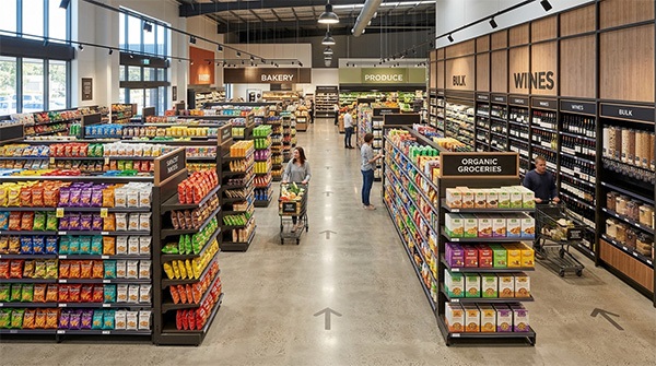
1. The Foundations: Strategic Store Layouts and Traffic Geometry
Foot traffic is guided by an invisible hand: your floor plan. The layout you choose dictates your store’s physical holding capacity and heavily influences customer dwell time.
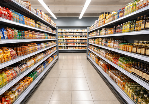
The Grid Layout: High-Efficiency Industrial Merchandising
Favored by major grocery chains and hard discounters like Aldi and Costco, the grid layout utilizes parallel aisle matrices to create a highly predictable shopper path.
-
The Space Advantage: It offers the highest possible floor space utilization with zero wasted corners. Standardized shelf dimensions streamline restocking speeds and easily accommodate high-volume cart traffic.
-
The Catch & Remedy: It can feel sterile and purely transactional. Shoppers tend to “bypas corridor lanes” to grab specific staples, missing impulse categories. To counter this, operators must leverage cross-merchandising and aggressive endcap promotions to break the “tunnel-vision” effect.
The Loop (Racetrack) Layout: The Art of the Non-Planned Purchase
This design features a prominent, wide central loop that guides customers in a specific direction (usually counter-clockwise, catering to right-handed biases) around the entire perimeter, bypassing themed category islands along the way.
-
The Space Advantage: It guarantees near-100% exposure for your primary shelving units. Shopper dwell time increases by an average of 20% compared to grid formats, dramatically driving up high-margin impulse buys.
The Free-Flow Layout: The Boutique Premium Experience
Characterized by organic, asymmetrical shelving placements and curved nesting tables, this layout is a staple for high-end organic markets and gourmet boutiques.
-
The Space Advantage: While you sacrifice up to 30% of raw product density, you trade volume for premium margins. The open, relaxed environment encourages browsing, lifting the average basket value per item.
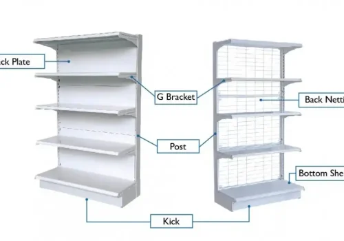
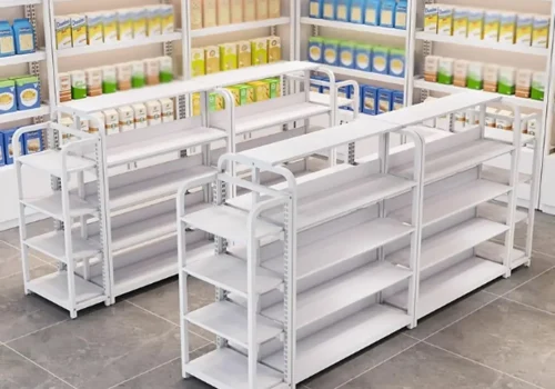
2. Going Vertical: The Strategic Symbiosis of Wall and Gondola Shelving
Your floor space is finite, but your cubic volume is wide open. Balancing your perimeter and center-store assets is key to building an open atmosphere without sacrificing holding power.
| Shelving Type | Core Merchandising Strategy | Spatial & Visual Optimization Principle |
| Perimeter Wall Shelving | Destination categories, bulky goods (e.g., dairy vaults, wholesale grains), premium niche brands, or designated clearance zones. | Can scale up to 7 or 8 feet (2.2+ meters) without suffocating the store. It acts as a visual anchor, drawing shoppers deep into the corners and expanding the perceived size of the sales floor. |
| Double-Sided Gondola Units | High-turnover consumer packaged goods (CPG), snacks, staples, and daily personal care items. | Keep heights restricted to 5 or 6 feet (1.5 to 1.8 meters). While you double horizontal capacity in the center aisles, you must maintain clean sightlines over the top shelf so customers can spot category signage across the room. |
Pro Tip from the Floor: Static spaces kill margins. Transition your store to modular, fully adjustable shelving units. In the summer, beverage facings expand, requiring larger vertical gaps; in the winter, when transitioning to dense, small-box holiday gift sets, compress those gaps. Never let empty vertical air sit on a shelf.
3. The Psychology of Shelf Height: Mapping the “Vertical Real Estate”
In retail psychology, there is a definitive hierarchy of visibility: “Eye Level is Buy Level.” Where a product sits vertically determines its velocity and its true real estate value.
-
1. Top Shelves (Above 5.5 ft / 1.6m) — “Brand Narrative & Long-Tail Niche”
This zone is out of comfortable reaching extension for the average shopper. Do not waste it on velocity items. Instead, use this space for premium, beautifully packaged, high-ticket items, or artisanal local brands that elevate your store’s curated authority.
-
2. The Golden Eye-Level Zone (4 ft to 5.5 ft / 1.2m to 1.6m) — “The Gross Margin Engine”
This is the most expensive commercial space in your store. Eye-tracking data reveals that this zone captures over 60% of consumer focus. Reserve this space strictly for high-margin private labels, leading CPG innovations, or massive global brands that pay premium slotting allowances to be front and center.
-
3. Kids’ Eye Level (2.5 ft to 4 ft / 0.8m to 1.2m) — “The Targeted Intercept”
Frequently mismanaged by independent grocers, this vertical slice should be meticulously packed with vibrant, high-sugar cereals, cartoon-licensed snack packs, and impulse toys. It leverages pester power directly at a child’s natural field of vision.
-
4. Bottom Shelves (Below 2.5 ft / 0.8m) — “The Destination Bedrock”
This is for low-margin, bulk, or heavy consumer staples (5-liter cooking oils, flour bags, bulk pet food, multi-pack paper towels). Because these are destination items, shoppers will actively seek them out regardless of placement. Furthermore, keeping heavy items low ensures a stable physical center of gravity for your fixtures.
4. Tactically Eradicating “Cold Zones” on the Sales Floor
Every floor plan has dead zones—areas plagued by poor natural lighting, awkward structural pillars, or distant foot traffic. High-tier operators use specialized secondary placements to force monetization in these cold zones.
Weaponizing the Endcap
Endcaps are the highly visible displays located at the ends of gondola runs facing the primary racetracks. Products featured on an endcap typically see a 3x to 5x spike in velocity compared to inline placement.
-
The Strategy: Never use an endcap as overflow storage. It must be curated for seasonal themes, aggressive loss-leaders, or high-margin bundle solutions. A high-impact endcap display disrupts the shopper’s pace along the main thoroughfare, enticing them to turn down a secondary aisle they originally intended to skip.
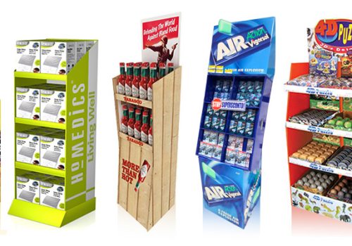
The Point-of-Sale (POS) Micro-Shelving
The 3 to 5 minutes spent waiting in line to check out represent the window where shopper defense mechanisms are lowest and impulse vulnerability is highest.
-
The Strategy: Deploy low-profile, double-sided risers and wire clip-ons directly into the queue lanes. Pack them with immediate-consumption items: gum, mints, single-serve snacks, batteries, and lip balms. The rule of thumb here is low cost, small physical footprint, and zero cognitive friction.
5. The Metrics of Comfort: Balancing Density via Data
While pushing for maximum holding capacity, you must monitor the point of diminishing returns. Pack shelves too tightly at the expense of human comfort, and your metrics will plummet.
-
Defeating the “Butt-Brush Effect”:
Discovered by environmental psychologist Paco Underhill, shoppers (especially women) will completely abandon a shelf if they are repeatedly bumped or brushed from behind while browsing. Your main thoroughfares must maintain a width of 6 to 7 feet to allow two carts to pass comfortably; secondary aisles should never dip below 4 feet. The revenue lost to corridor crowding far outweighs the profit of squeezing in one extra shelving unit.
-
Data-Driven Planograms:
Modern space management relies heavily on camera-based heat mapping and dedicated planogram software. By auditing actual traffic flow quarterly, you can see exactly which runs are pulling their weight and which allocations are stagnant. Let your POS sales data dictate your linear shelf feet, not guesswork.
Conclusion
Supermarket shelving is not a static display framework; it is a dynamic chess match played between your inventory, your square footage, and human psychology. To truly unlock your store’s hidden capacity, remember the core philosophy: expand vertically, guide horizontally, monetize the dead zones, and never compromise shopper comfort. By executing these targeted adjustments, even an established neighborhood market can experience a massive surge in tracking volume and real estate yield without adding a single foot of external construction.